Note
The NoteSummary component discussed in the post no longer works as described, so the information is outdated. However, the post will remain available in case you're interested in the library or how it was used. — (23/06/25)
More often than not, when making a website, you'll have to make sure you are able to support various interfaces, such as for those on mobile devices. Most of the time, this involves various UI or code changes that you must make based on the platform.
For example, in Notetxt, I had a component named NoteSummary which made a toast using sonner appear when the user clicked on a button on the bottom right of the page, containing various metrics about the note contents:
Video of toast on desktop
I'll spare the details behind the component, as you can view this version of it here, but the toast was initially set up with a fixed position regardless of the device. Here was the initial implementation I used:
import React from 'react';
import { toast } from 'sonner';

toast.info(
  <div>
    <div className="text-xl font-semibold text-zinc-100">
      Summary
    </div>
    <div className="text-xs text-zinc-300 mb-2">
      This is a summary of various metrics about your note. Click on the button again to refresh these metrics.
    </div>
    {infoItems.map(({ label, value }) => (
      <div key={label}>
        <strong className="text-zinc-200 font-semibold">{label}:</strong>
        <span className="font-semibold text-pink-300 ml-1">{value}</span>
      </div>
    ))}
  </div>,
  {
    duration: 5000,
  }
);
With this implementation, the toast was shown for 5 seconds on the screen.
On mobile, these toasts span the whole width of the bottom of the page. Subsequently, the toast ends up looking like this:
Video of toast on mobile
Here, you can notice that the 'Note Summary' button gets covered up by the toast, preventing you from pressing it again until you either drag it down or close it with the X. In my case, I wanted to keep the toast in the bottom right on desktop, since it worked fine there, but have it be on the top of the screen on mobile.
The Solution
To solve this, we can install react-device-detect, which uses user agent sniffing to detect the user's device based on information about it:
npm install react-device-detect --save
After that, we can add the named import isMobile and use it:
import { toast } from 'sonner';
import { isMobile } from 'react-device-detect';

// ...previous logic
{
  duration: 5000,
  position: isMobile ? 'top-left' : 'bottom-right',
  className: isMobile ? '' : 'move-desktop-toast-up',
}
In the case above, for the position:
- If
isMobileis true,top-leftis applied as the position for mobile. - If
isMobileis false,bottom-rightis applied as the position for desktop.
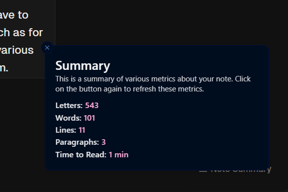
With that, we had different positions for the toast depending on the device. Here is the comparison of the positions of the toast before after side by side on mobile:
| Before | After |
|---|---|
bottom-right | top-left |
You can also see that I had a conditional to apply the move-desktop-toast-up class to the toast if the user is on desktop, otherwise, if they aren't, it's hidden.
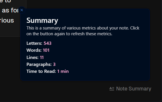
Simply put, this class moves the toast up 25 pixels from the bottom, so that the toast does not block out the button on desktop as well due to the positioning:
.move-desktop-toast-up {
  bottom: 25px !important;
}
With that CSS class applied, here is the before and after comparison:
| Before | After |
|---|---|
 |  |
The button is no longer covered by the toast, letting you click it again.
Detecting a specific device
You can also use react-device-detect to detect a specific device, such as an iOS device, and have different logic for them.
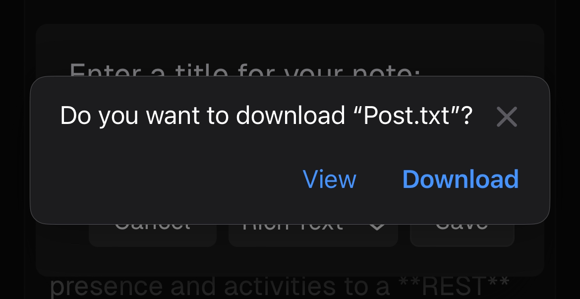
For example, in Notetxt, I have a feature where you can download the note to your device. On iOS, however, when you download a file, you will get an alert like the one below:

I have the code below to show a success toast when the download is complete:
toast.success('Saved to your device!', {
  description: `Check your recent files to find the note! Re-open it here at any time by pressing Ctrl+O or the 'Open Note' option in the command menu and selecting the correct file.`,
});
Originally, this also showed up on iOS devices, even when the user pressed 'View' (which took them to the blob) or exited out of the alert. Thus, it made the user think the note successfully downloaded, even when it actually didn't.
To resolve this, I committed a change which replaced the previous implementation with the isIOS named import from the library, and a conditional using isIOS to detect whether if the user was using an iOS device or not:
import { isIOS } from 'react-device-detect';
import { toast } from 'sonner';

// On iOS, if the user dismisses the download alert, the success toast might still show. To handle this, show a different toast.
if (isIOS) {
  toast.info('Check your downloads folder.', {
    description: `Make sure you clicked 'Download' on the alert that appeared to download the note to your device. If you didn't, the note did not download.`,
  });
} else {
  setTimeout(() => {
    toast.success('Saved to your device!', {
      description: `Check your recent files to find the note! Re-open it here at any time by pressing Ctrl+O or the 'Open Note' option in the command menu and selecting the correct file.`,
    });
  }, 400);
}
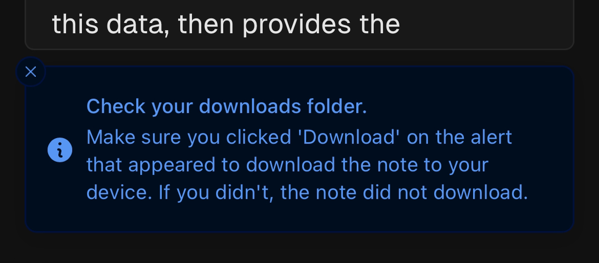
Now, instead of the success toast showing up all of the time, the info toast would show up on mobile instead, informing the user to make sure they check their downloads:

Anyway, there is a lot more in the library you can take advantage of, but I've just highlighted the parts I used within my specific use cases. For example, you could also use the other selectors, switch to different views depending on the device, and more.
If you want to use this library, check out its documentation on GitHub!